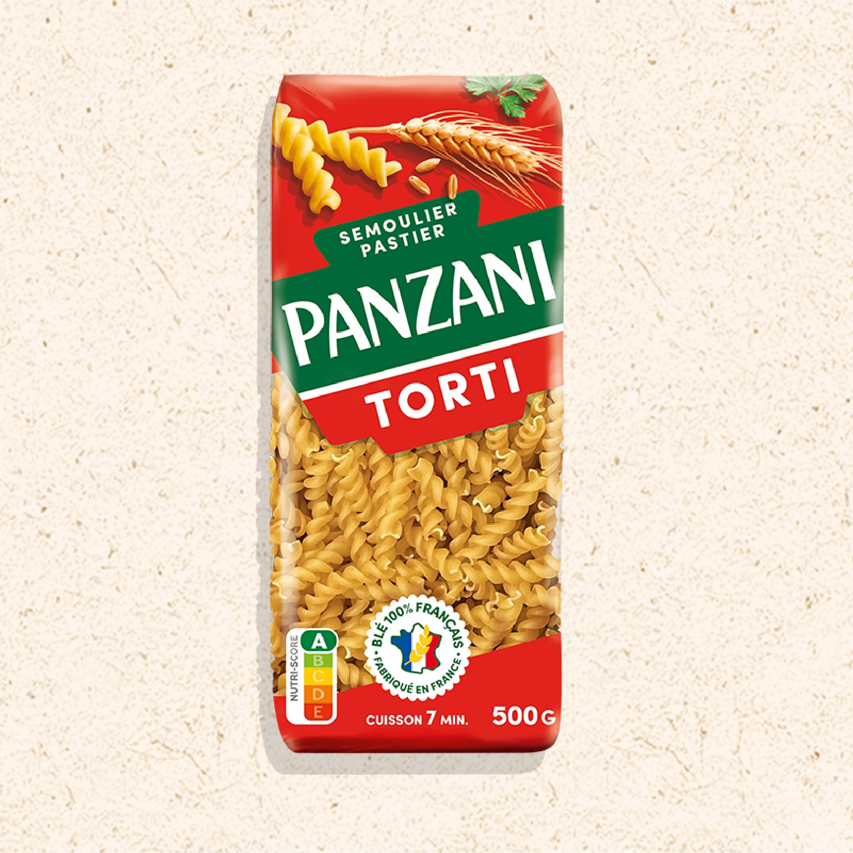
FRENCH PASTA WITH AN ITALIAN STORY
Challenge :Reaffirm the brand’s founding Italian story and long-term leadership without being stuck in the past.
Group and company : Panzani is France’s most iconic pasta brand, a name that has fed generations and whose Italian soul had become harder to read over time.
Potential : The pasta category is evolving. Consumers are looking for more enjoyment, natural ingredients, and local relevance, while private labels and global competitiors continue to raise the pressure. The risks were clear: gradual commoditization, fading differentiation, internal fragmentation following changes in ownership and governance, and declining brand salience. The challenge was to reinforce long-term leadership through clarity, coherence and renewed distinctiveness across the corporate brand, retail and responsibility, both internally and externally.
Group and company : Panzani is France’s most iconic pasta brand, a name that has fed generations and whose Italian soul had become harder to read over time.
Potential : The pasta category is evolving. Consumers are looking for more enjoyment, natural ingredients, and local relevance, while private labels and global competitiors continue to raise the pressure. The risks were clear: gradual commoditization, fading differentiation, internal fragmentation following changes in ownership and governance, and declining brand salience. The challenge was to reinforce long-term leadership through clarity, coherence and renewed distinctiveness across the corporate brand, retail and responsibility, both internally and externally.
Creative Solution
STRATEGY BEFORE VISUALS
Our response was strategic before it was visual. We defined a design-led platform, “The Power of Lifelong Brands”, structured around four pillars: Anchoring, Performance, Mission and Responsibility. This framework aligned business ambition with brand expression.
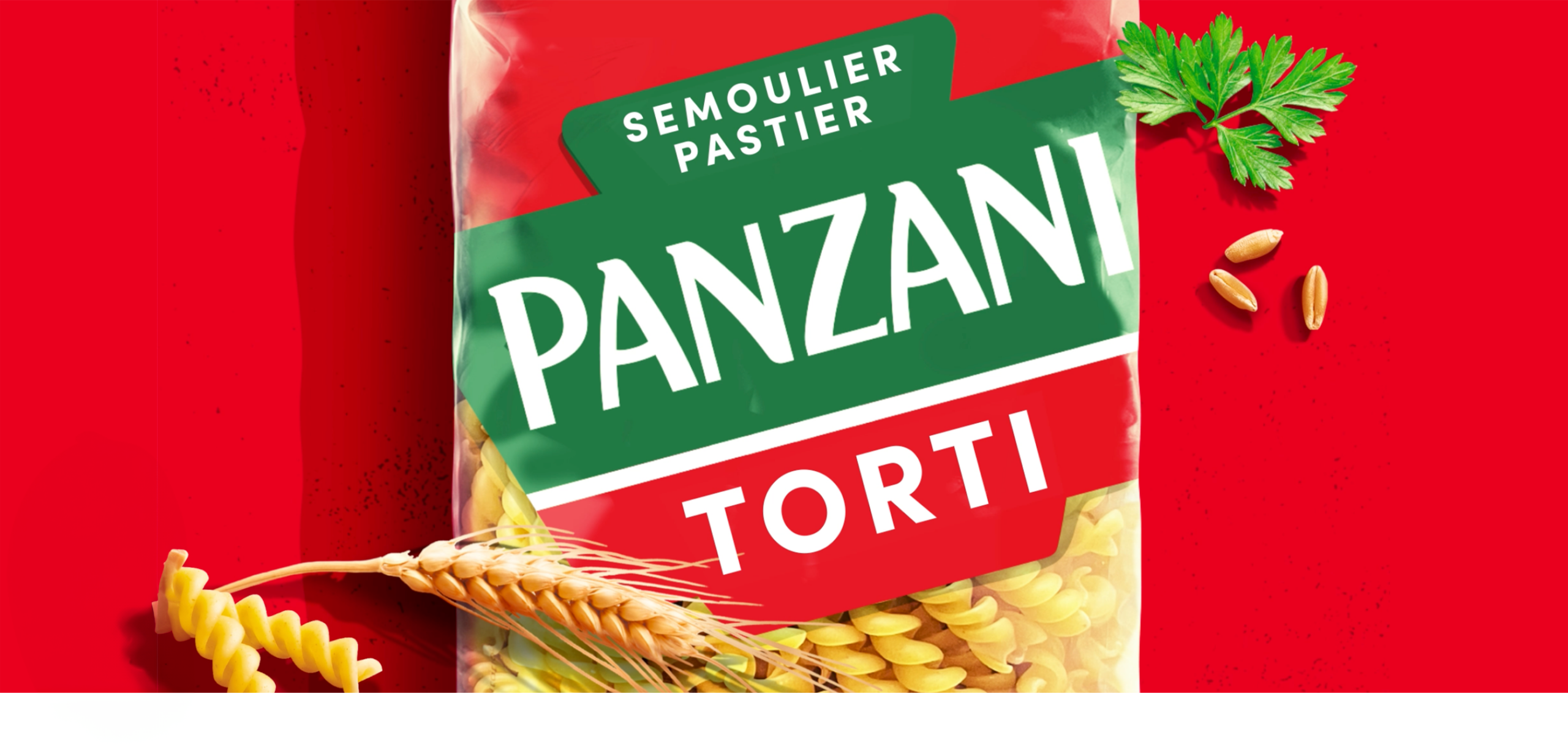
We treated the logo not as a symbol, but as a system. By extracting and amplifying distinctive assets, from the wheat icon to typographic and color codes, we built a flexible visual architecture. Packaging, retail, digital and corporate communications were designed to contribute to the same equity system.
Creative Solution
STRATEGY BEFORE VISUALS
Our response was strategic before it was visual. We defined a design-led platform, “The Power of Lifelong Brands”, structured around four pillars: Anchoring, Performance, Mission and Responsibility. This framework aligned business ambition with brand expression.
We treated the logo not as a symbol, but as a system. By extracting and amplifying distinctive assets, from the wheat icon to typographic and color codes, we built a flexible visual architecture. Packaging, retail, digital and corporate communications were designed to contribute to the same equity system.
HERITAGE MADE CURRENT
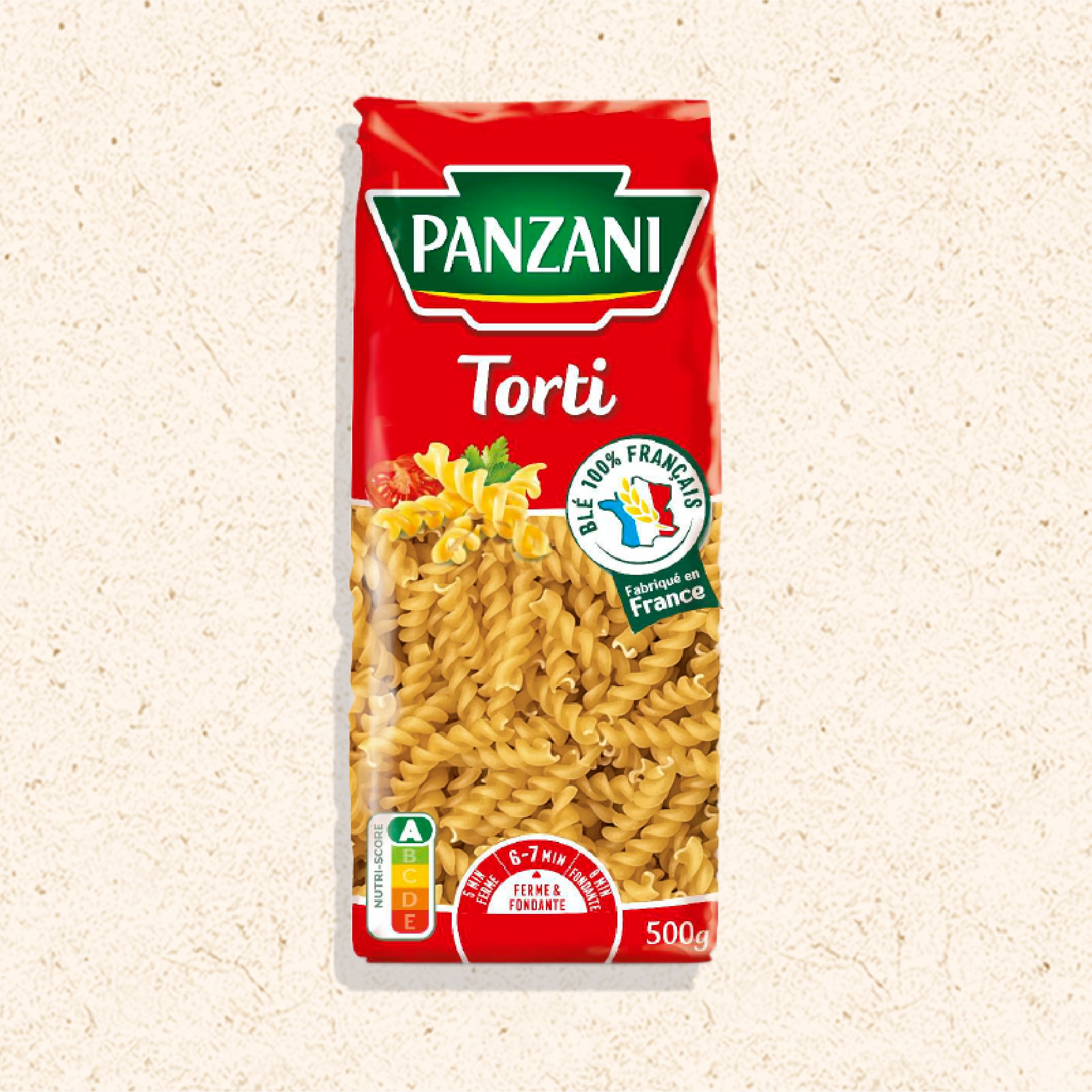
Heritage was reframed as an asset of modern relevance. Emotional value was restored without abandoning functional credibility. Responsibility was given a clear visual language, embedded within the core identity rather than treated as an add-on.
RESULTS
LEADERSHIP NEEDS CLARITY
The result is a brand universe that operates as a coherent whole. Packaging performs harder on shelf. Corporate and CSR narratives align. Internal teams share a common direction. Value growth of +31% in pasta and +35% in sauces between 2021 and 2023, stable share in a rising private label context, and share gains in sauces demonstrate that strategic design, applied systemically, builds clarity, confidence and durability for future growth.