THE FRENCH ART OF MEAT

Challenge :Take Bigard from a well-known producer into a genuine brand, one that embodies and elevates the French art of meat at a time when meat consumption is declining.

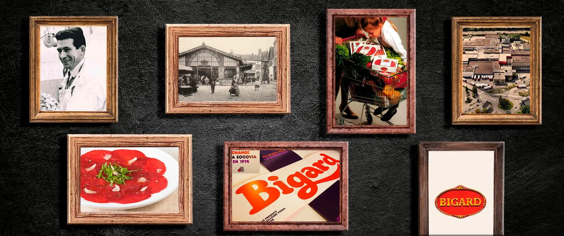
Group and company : Bigard is the leading meat company in France. A family group founded in 1968, its name reaches most French kitchens, yet for decades it spoke as a producer rather than a brand. In 2020, as meat consumption declined across Western Europe, the company chose affirmation over retreat. It set out to stand as the ambassador for French butchery, and Team Créatif was brought in to give the name a character equal to its scale.

Potential : The French, like consumers across Europe, are eating less meat. But when consumption becomes occasional, it becomes deliberate. Every purchase carries higher expectations of origin, quality and craft. For a volume leader, this is the commodity trap: a name everyone knows, a brand no one can describe. The challenge was not to sell more meat. It was to make Bigard stand for something.
Creative Solution

LESS MEAT, MORE MEANING

We began with the identity, not the design. Workshops with Bigard’s teams asked a single question: who is Bigard? The answer was the Ruler archetype. A leader that believes in exemplarity, offers security and stability, and has proven itself over time. From the archetype came the brand platform, and from the platform came a promise rooted deep in the French culture: to bring the art of the butcher, a figure the French still trust above all when it comes to meat, to every table. Not just a slogan but a standard to live up to.

A CREST, NOT A LOGO

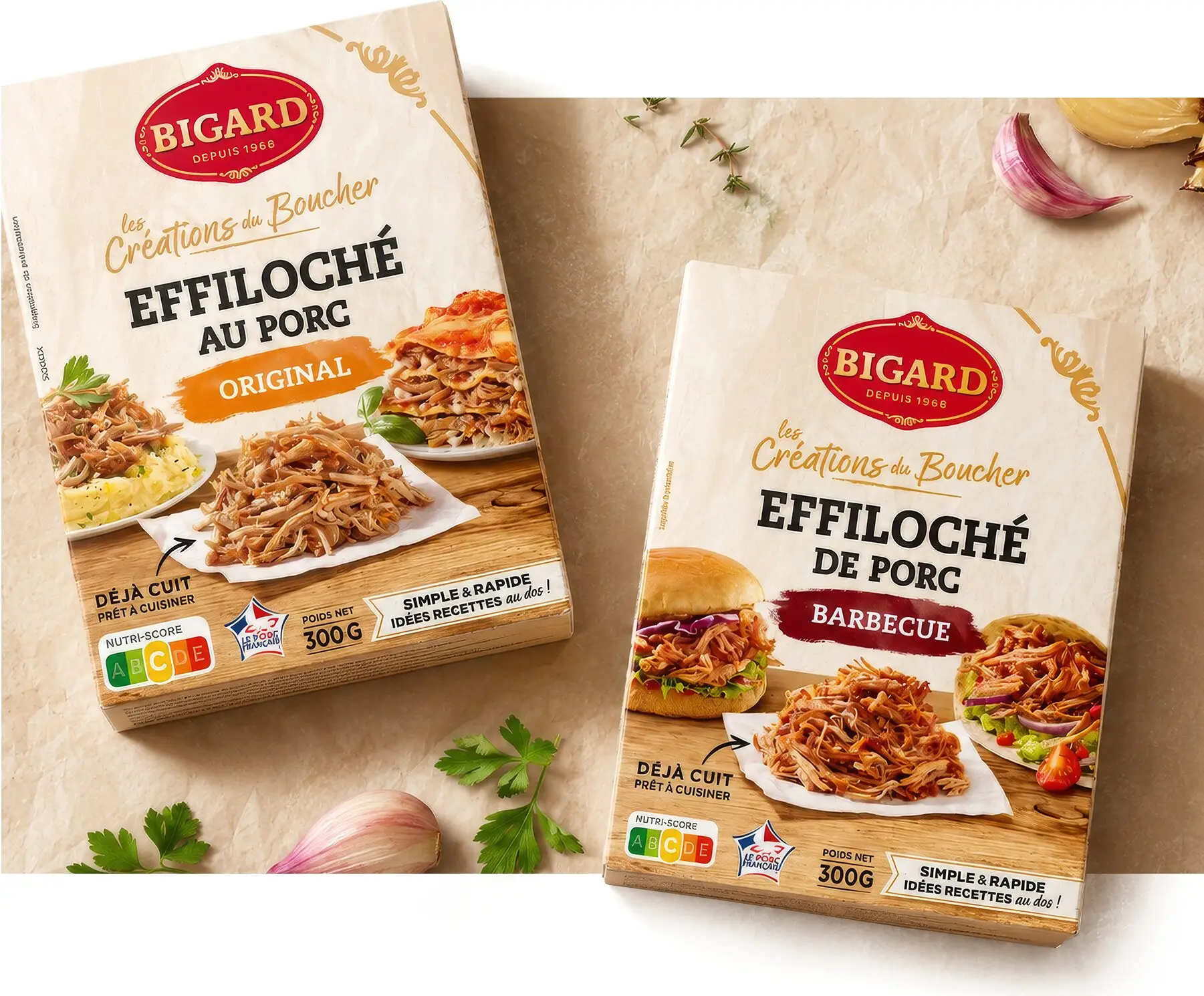
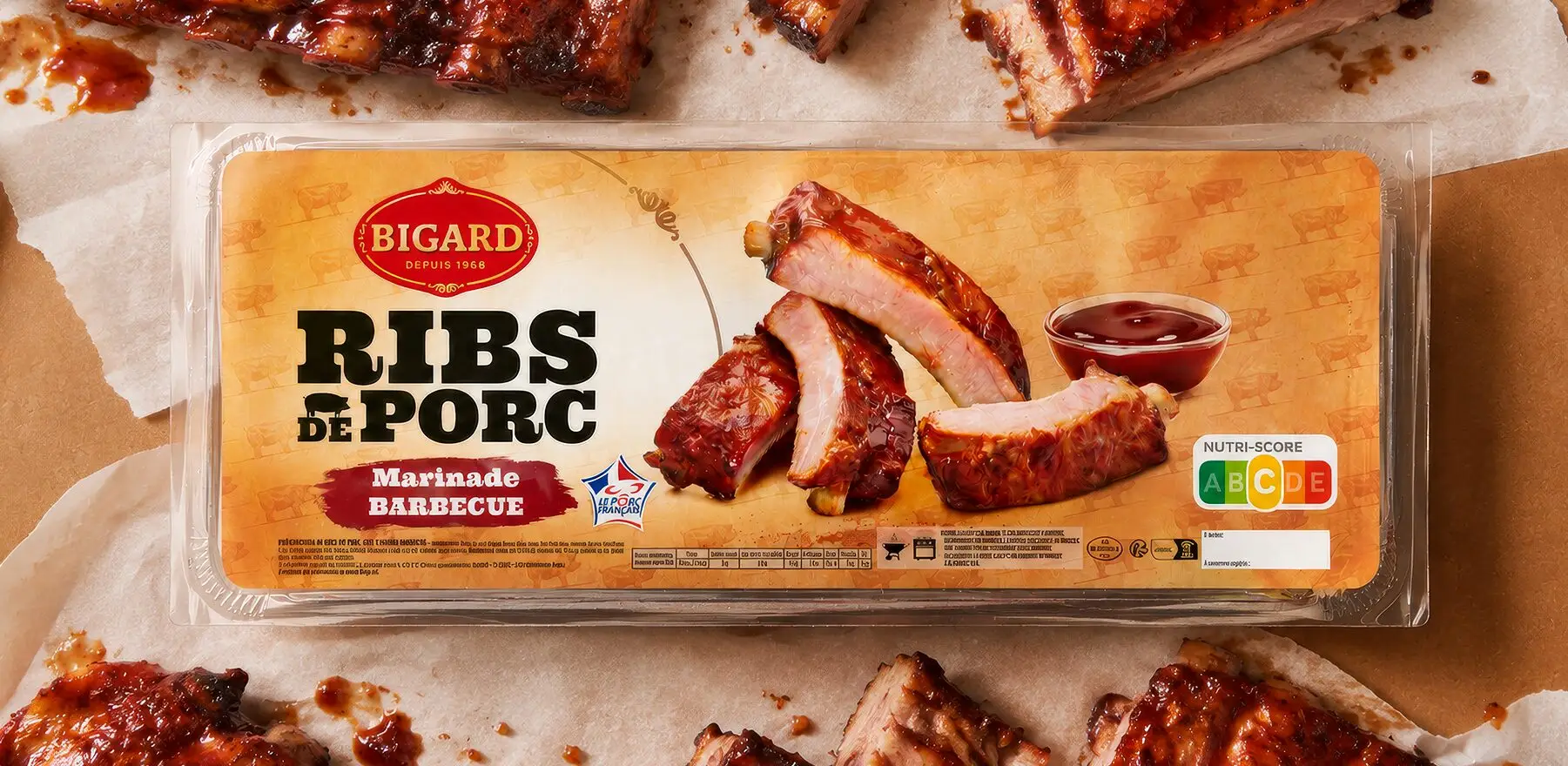
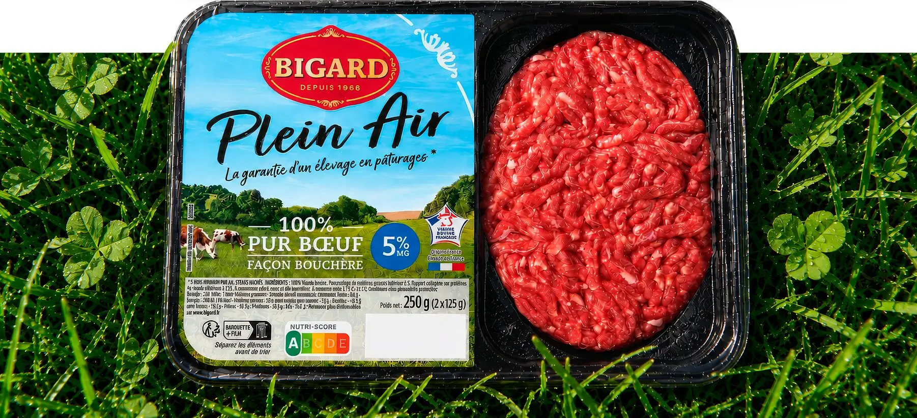
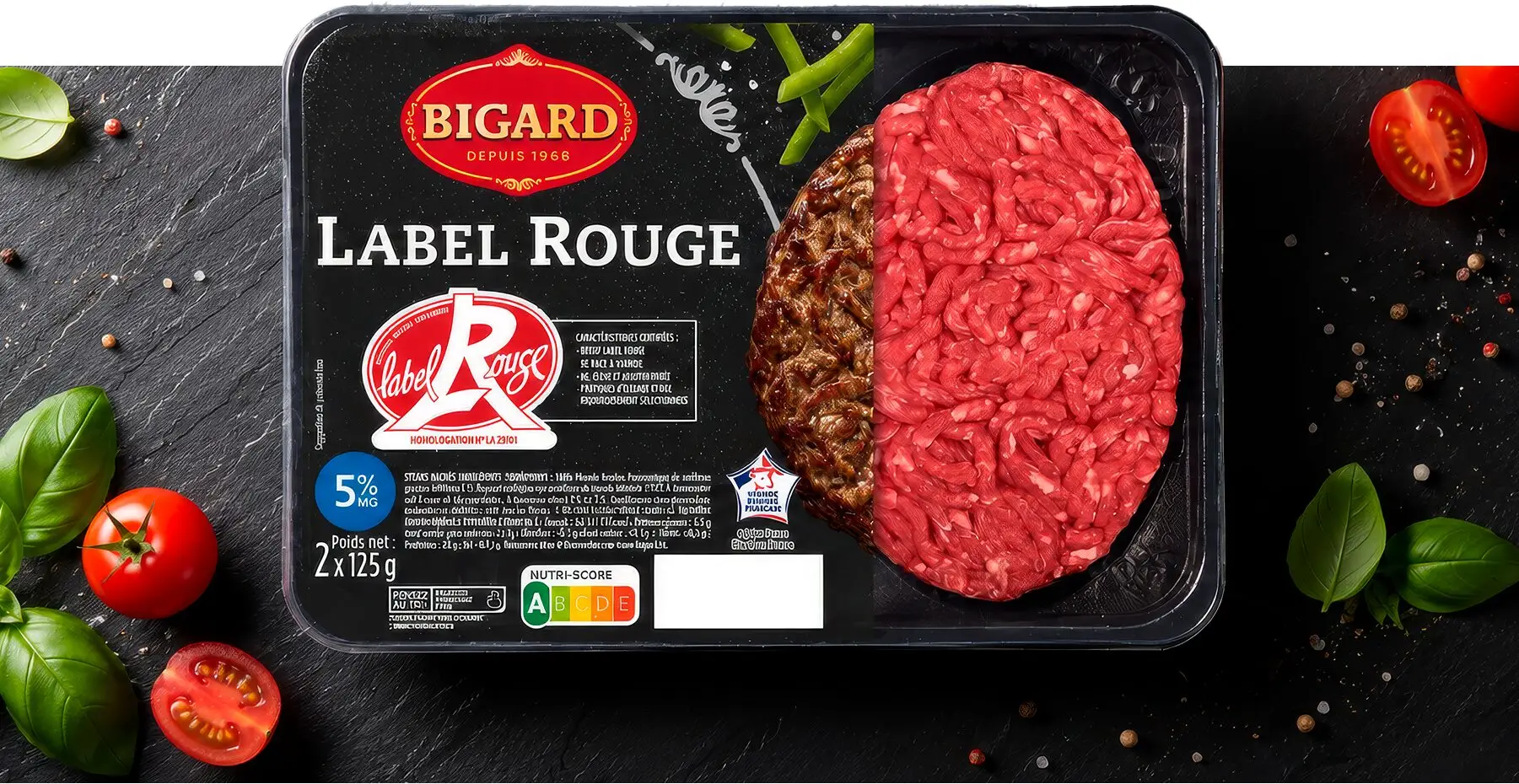
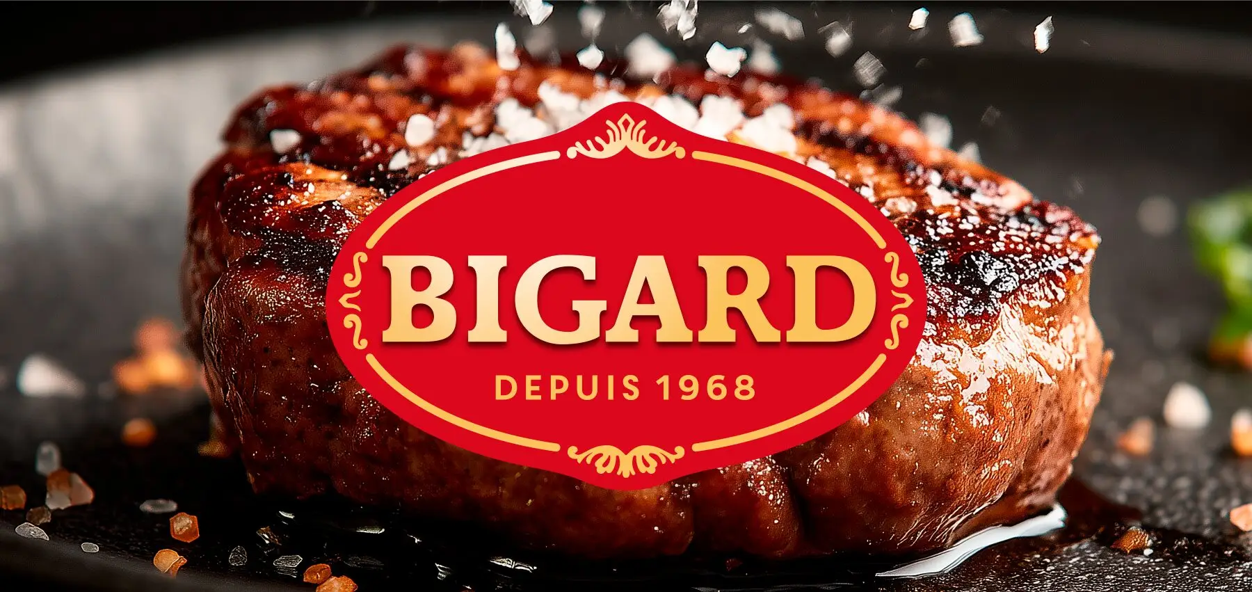
The identity elevates what was already there. The crest was revalued, not replaced: gold for expertise, structure for stability, the founding date as proof of permanence. Around it, a visual language drawn from the butcher’s counter: kraft paper, handwritten script, the codes of the trade and of the craft. Meat was no longer a raw material, but as a product with a maker.

ONE HOUSE, EVERY TABLE

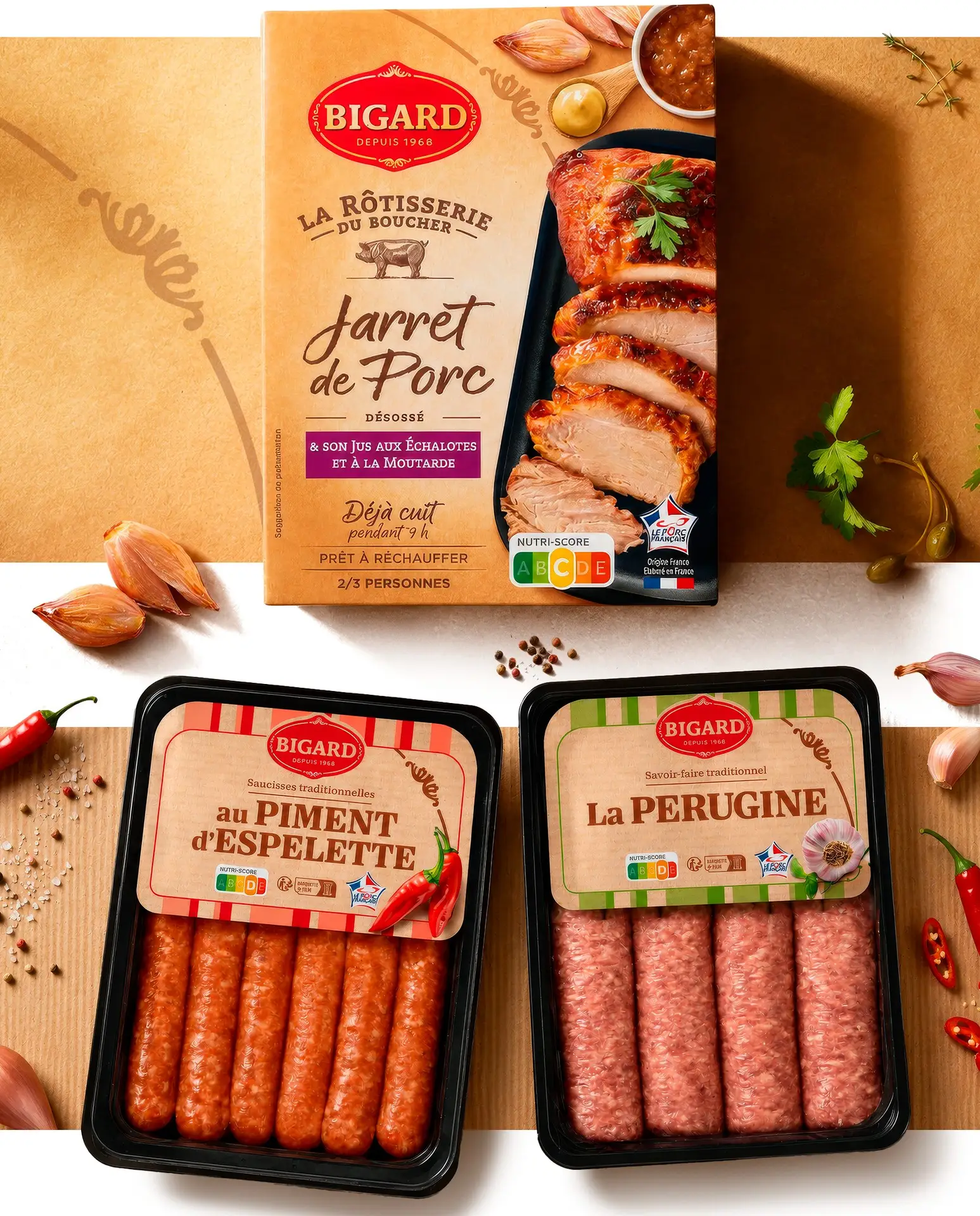
A brand this large needs architecture, not decoration. The portfolio was structured into three tiers: core, premium and specific. Five constant assets hold it together: logotype, color, structure, icon and visual. The system flexes without fracturing. Summer yellow for the grill, deep night blue for festive occasions, illustrated kraft for regional recipes. One grammar for every occasion.

Results

BUILT TO CARRY VALUE

The result is a masterbrand that behaves like one: consistent on shelf, distinctive in expression, and a design system that elevates a category under pressure, from everyday minced beef to festive centerpieces. Bigard no longer just produces meat. It puts its name on it.