An iconic brand, now even closer to Brazilians.

The challenge

Present in homes and on family tables for decades, Sadia is the most beloved food brand among Brazilians and also one of the most valuable in the country. However, in an increasingly dynamic market, it needed to be renewed and reinvented. The challenge was to update the brand’s visual identity, making it more democratic, expressive, and relatable to younger generations, without losing the strength of its proprietary assets, which have made Sadia a true national icon.

The solution

We created a contemporary, vibrant, and even more proprietary visual system. The iconic “S” gained prominence and flexibility.Criamos um sistema visual contemporâneo, vibrante e ainda mais proprietário. The yellow was updated with more natural tones to maintain its prominence on the shelf, without losing its lightness. Lek Trek returned as a brand ambassador, reinforcing the emotional connection with consumers.


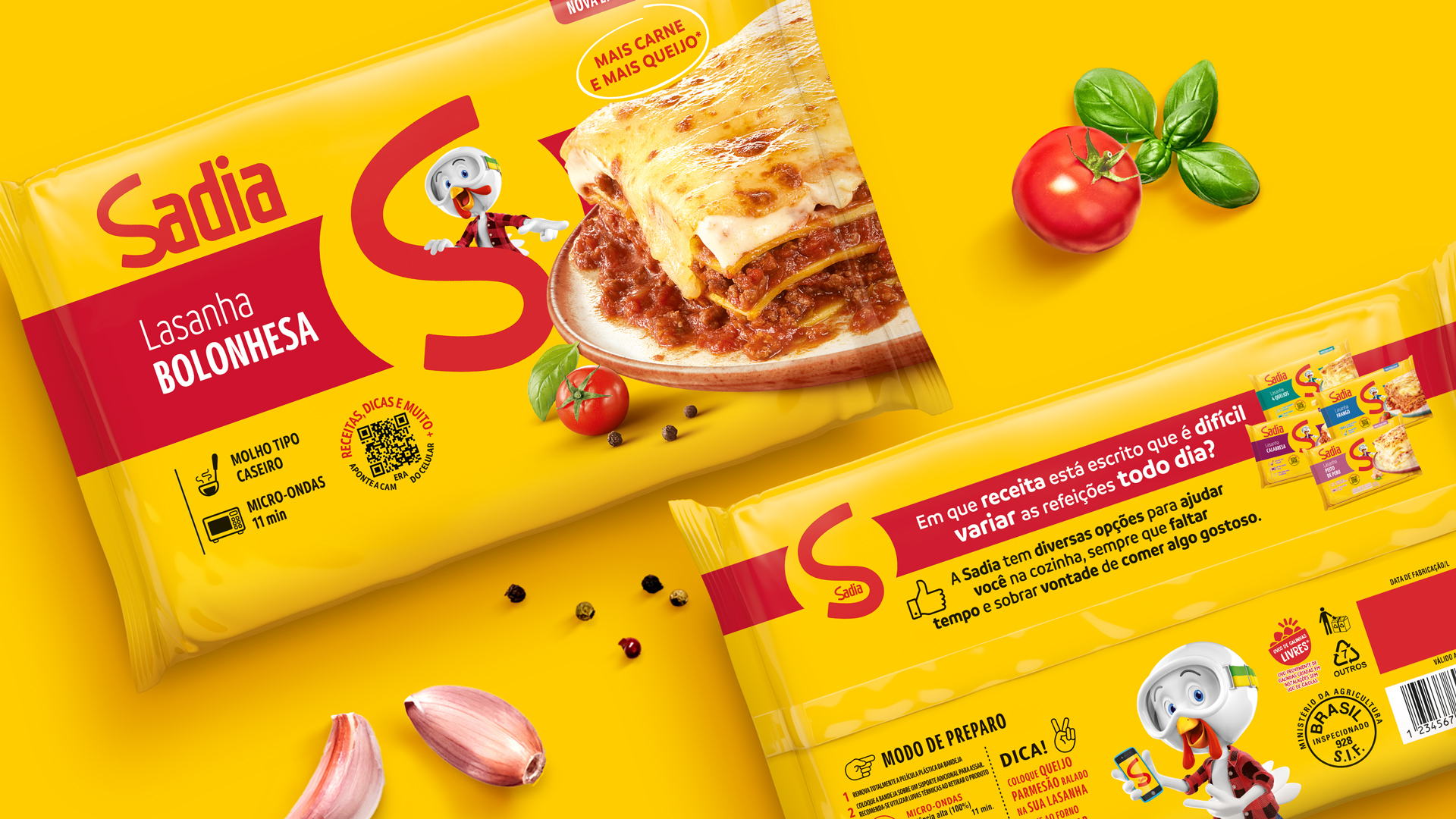
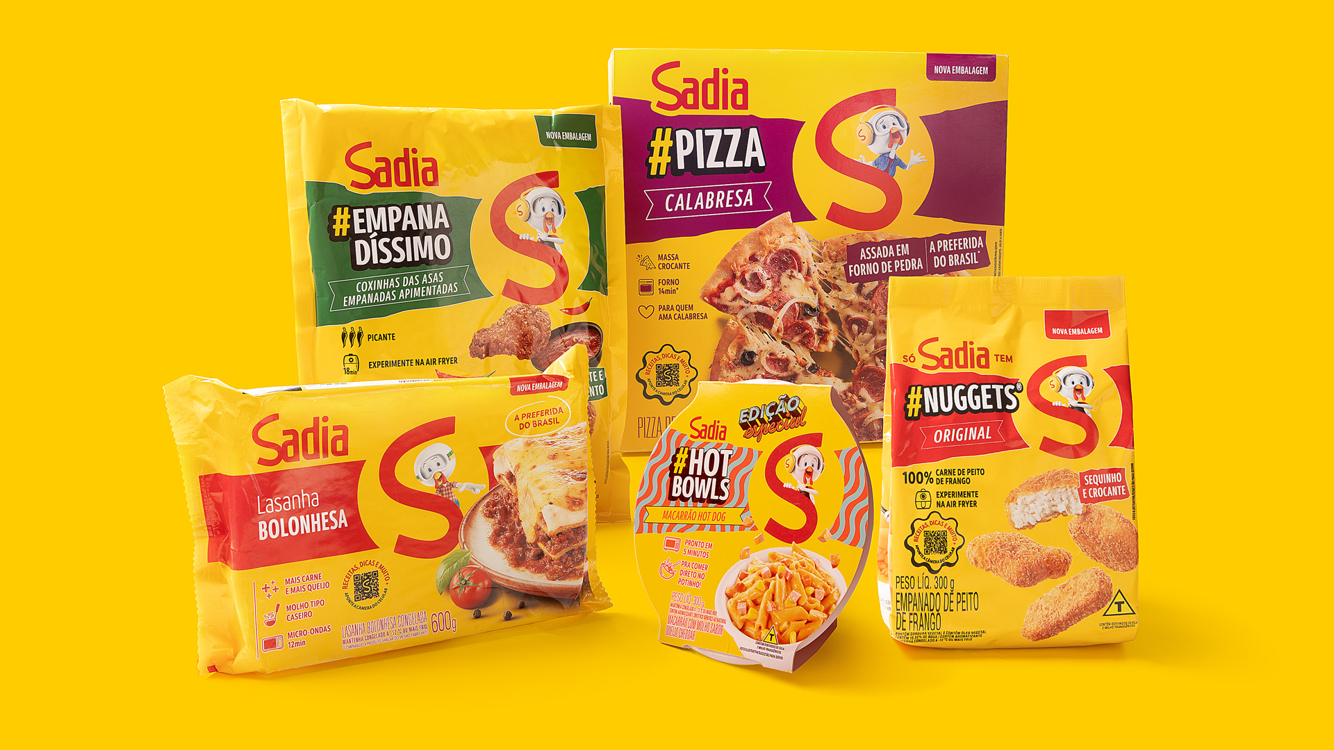
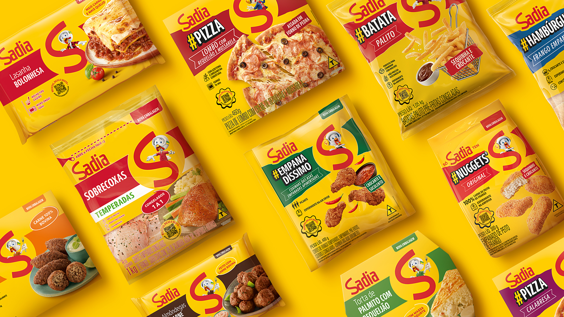
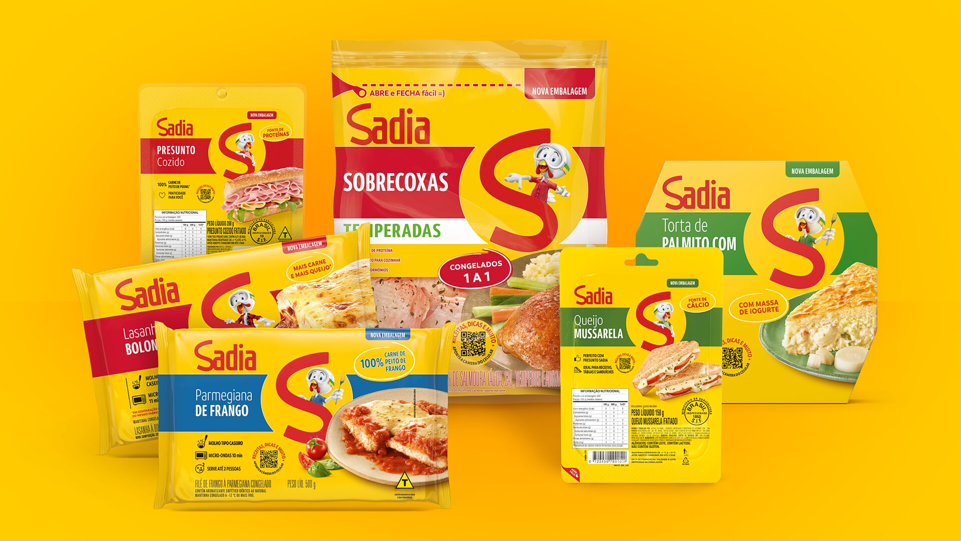
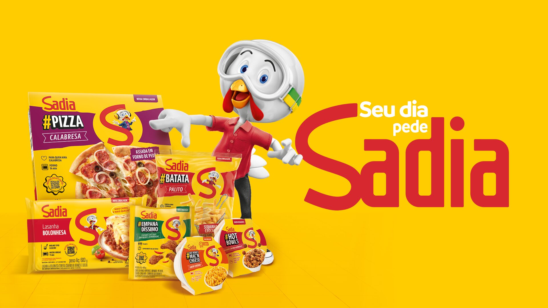
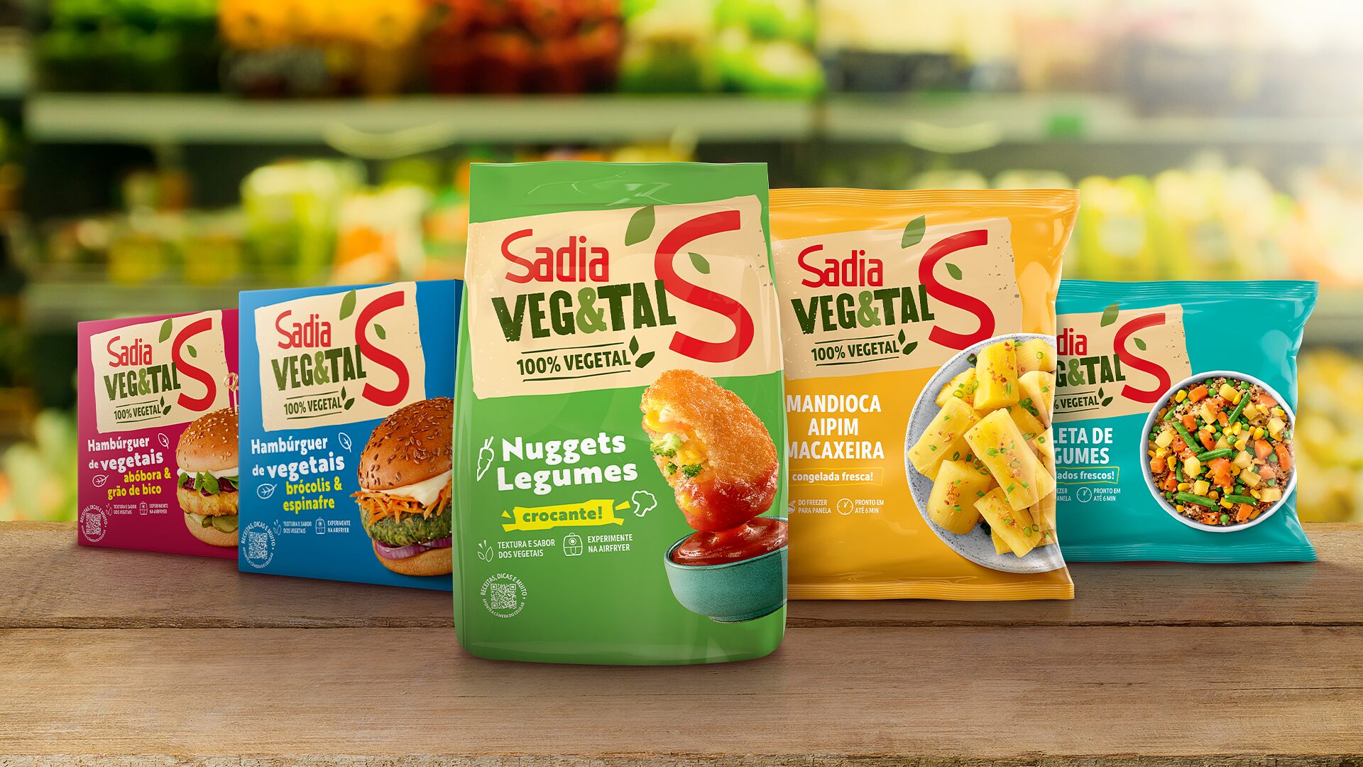
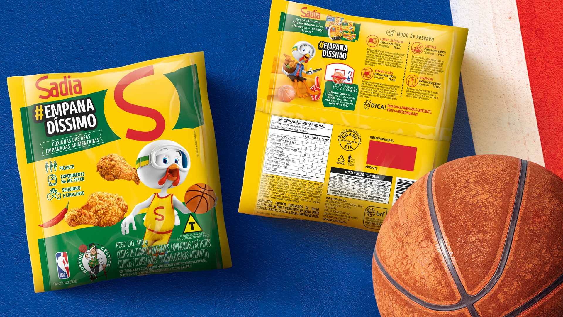
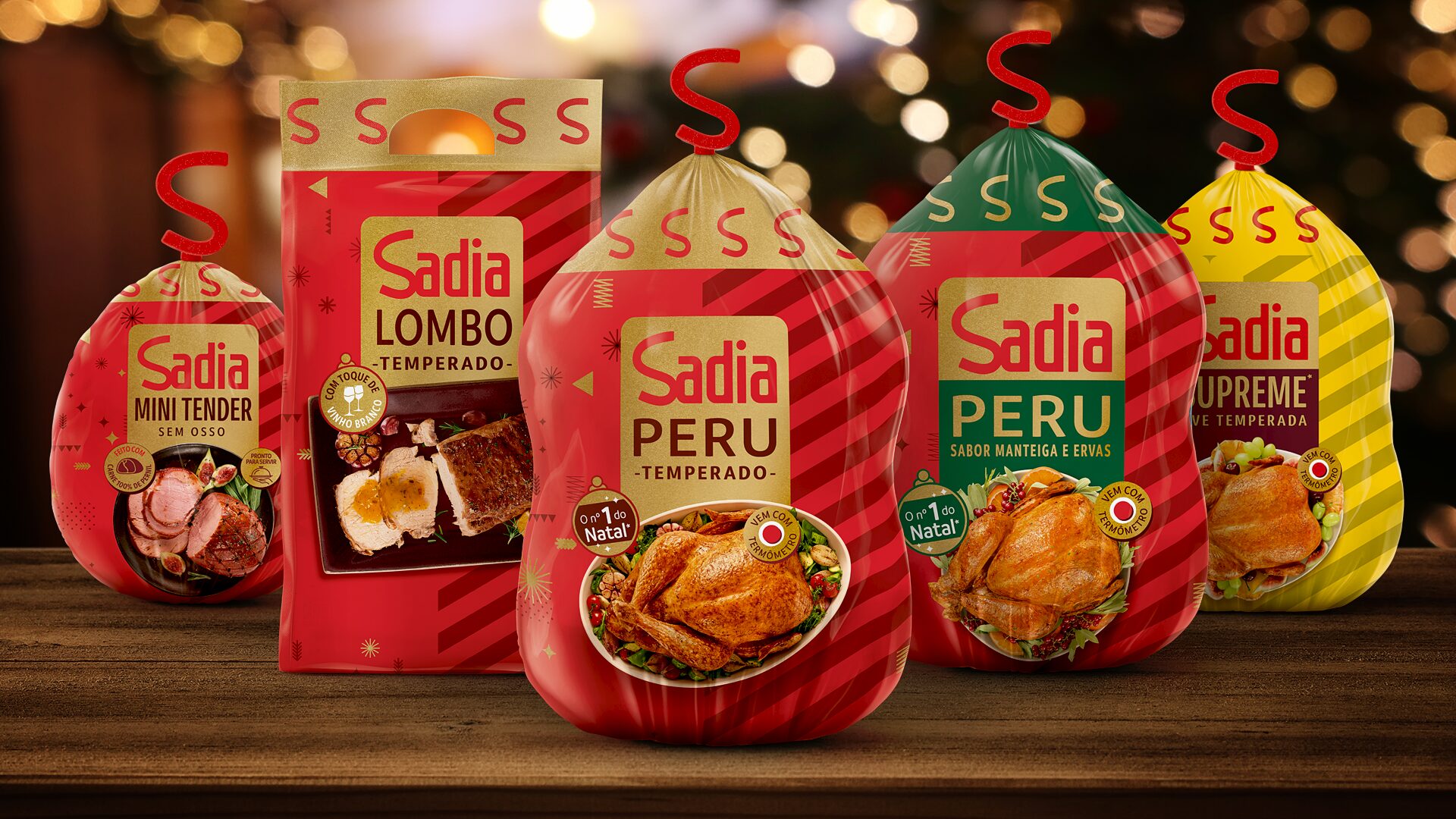
The layouts became cleaner and more informative, with direct claims, more appetizing photos, and easier-to-read typography. Finally, the packaging gained QR Codes with recipes, playlists, and special content that reinforce the connection with the brand.

More than a character, a true brand ambassador.

For over 20 years, we have passionately and carefully developed the personality of Lek Trek, Sadia’s famous mascot.
We delved into its identity to create new attitudes, poses, and visuals that resonate more authentically with people, while also reinforcing the image of the parent brand with younger generations.

The result


A new identity that speaks to the future, preserving the assets that guarantee Sadia’s ownership and differentiation. Through this renewal, we made the brand even more vibrant and expanded its relevance to different audiences by combining tradition, innovation, and Brazilian identity.

Visual elements play a strategic role.

Clearly defining the assets not only makes the packaging more attractive but also facilitates reading, increases recognition, and strengthens the brand’s connection with consumers.
We rethought the main visual elements to make them more consistent and impactful, ensuring greater prominence and differentiation for Sadia products at various points of sale throughout Brazil.