
THE FIRST TEA BRAND
IN THE WORLD
Challenge : Restore coherence and authority to a global brand whose visual identity had drifted across markets.
Group and company : Lipton is the world’s leading tea brand, with a global presence, a rich history,
and strong brand recognition.
Potential : Decades of local adaptations have diluted brand consistency and weakened the impact of their distinctive assets. The task was to anchor what matters, elevate what performs, and build a system capable of guiding global deployment at scale.
Creative Solution
BACK TO WHAT WORKS
Our strategic vision was rooted in stewardship. We identified the core equities with enduring recognition and treated them as strategic capital. The red cartouche was retained and refined to signal authority. The logotype was redrawn in capitals to strengthen stature and global readability. Yellow, the most powerful brand asset, was recalibrated to deliver luminosity and shelf dominance with discipline. Every decision was made to strengthen clarity,
consistency, and recognition.
consistency, and recognition.
THE WAVES THAT CONNECT
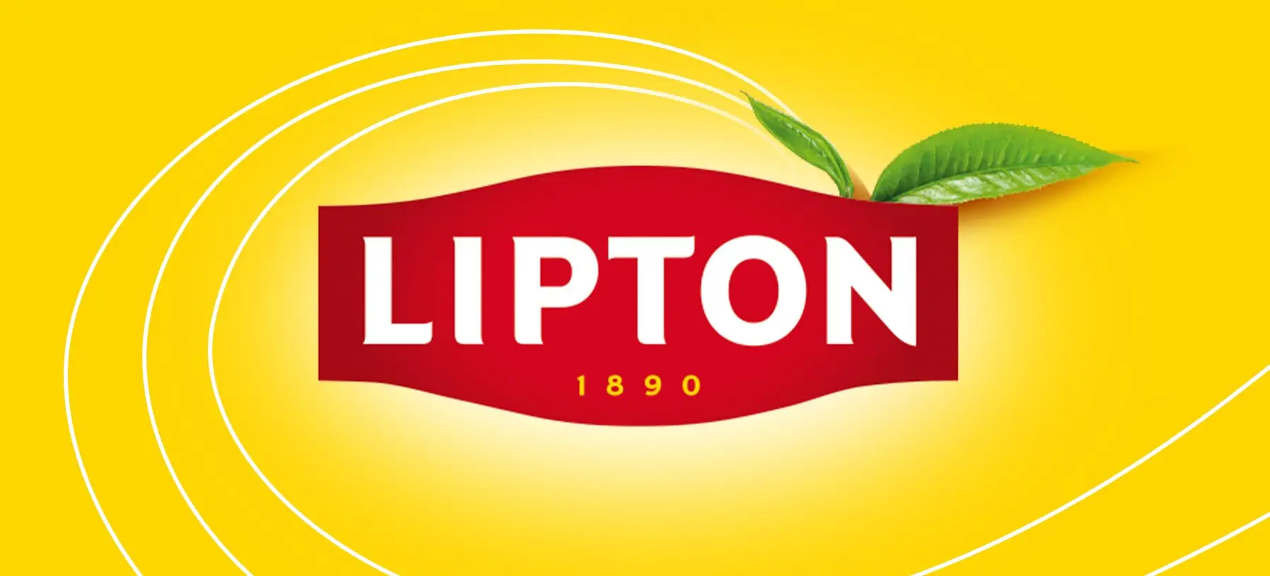
The Aroma Waves were introduced as the backbone of the visual system. More than a decorative element, they act as a living connector between nature cues (the leaf icon), the logotype and the product expression. One continuous motion, binding every touchpoint into a single,
coherent brand language.
coherent brand language.
DESIGN AS PERFORMANCE
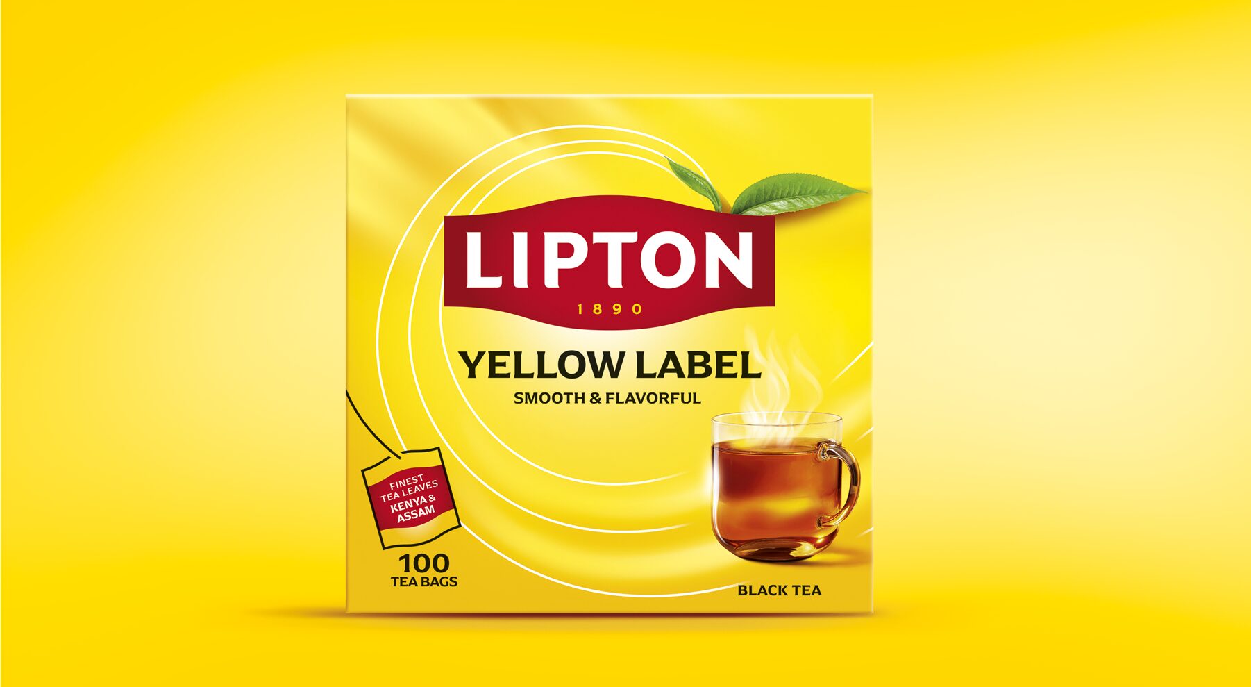
The cup was redesigned to strengthen category cues and bring sensory appeal. Navigation was simplified to prioritize range architecture and make choosing easier. A robust Brand Visual System was developed to ensure consistency across packaging, digital and in-store activation, giving local teams the flexibility while protecting integrity
of the brand.
of the brand.
RESULTS
BUILT TO LAST YELLOW
The result is a masterbrand rebuilt with precision. More visible. More consistent. More assured. A system designed not for short-term uplift, but for long-term clarity, confidence
and consistent global growth.
and consistent global growth.