
RECONNECTING A FRENCH
ICON WITH ITS HERITAGE
Challenge : Reconnect a French icon with its heritage while making the brand more distinctive, contemporary and indulgent.
Group and company : Founded in 1905, St Michel is a French family-owned biscuit maker and one of France’s most beloved biscuit brands. It has always stood for authentic French indulgence: biscuits crafted with simple ingredients, traditional know-how, and a deep connection to the French countryside.
Potential : Over time, the brand’s visual identity had gradually drifted away from some of its most powerful original assets. Team Créatif’s mission was to reconnect the brand with its roots, restore consistency across every touchpoint, and communicate its commitments with greater clarity and transparency.
Creative Solution
BRINGING BACK THE ICONIC ORANGE COLOUR
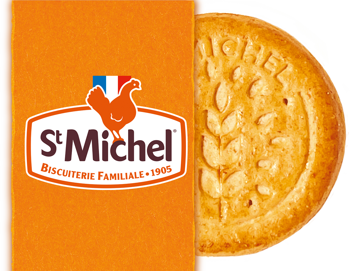
One of the brand’s most distinctive assets is its historic orange color. By reinstating orange as a vivid, powerful and consistent color-branding asset, we delivered outstanding shelf-blocking power while reinforcing the brand’s emotional promise: generous French indulgence.
A SYMBOL OF RURAL HERITAGE AND AUTHENTIC INGREDIENTS
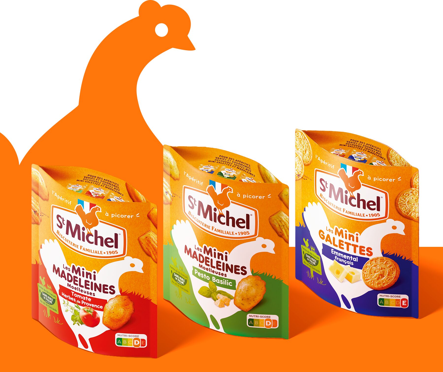
Chosen by the founder, Mr. Grellier, in the early years of the brand, the hen embodies the very essence of St Michel. By preserving and celebrating this historic symbol, the brand reaffirms authenticity, agricultural heritage and respect for French terroir.
ST MICHEL DEFENDS WELL-MADE INDULGENCE
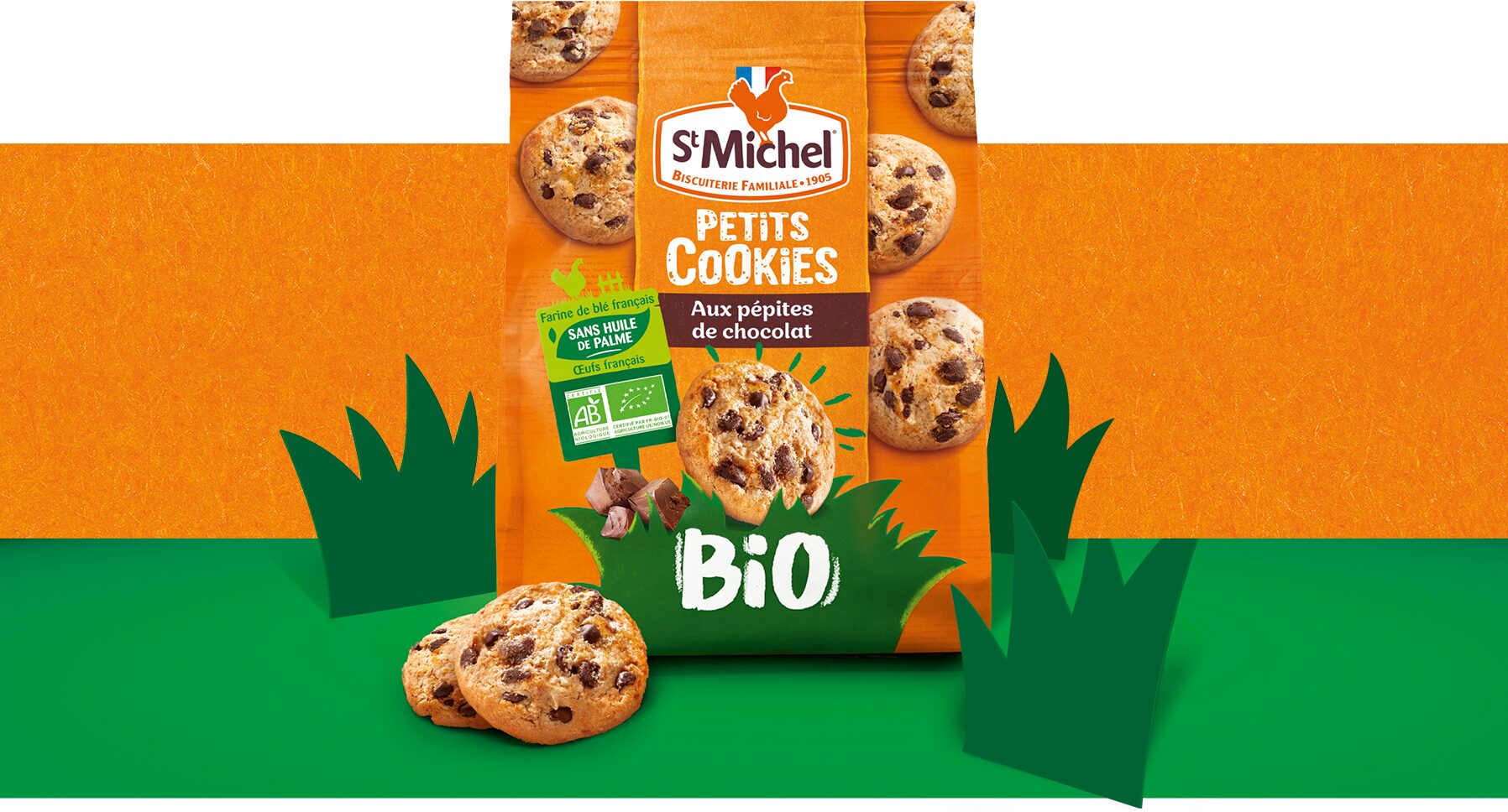
To make the commitment to well-made indulgence clearer and more transparent, Team Créatif developed a new brand asset: the Green Score Card. This visual system highlights the quality and French origin of the ingredients used in each recipe.
A BRAND ROOTED IN FRENCH TERRITORIES
The brand’s connection to French territories is also expressed through its biscuit factories in Contres, Commercy and Avranches, which embody regional craftsmanship, local agriculture and French territories.
A BRAND ROOTED IN FRENCH TERRITORIES
The brand’s connection to French territories is also expressed through its biscuit factories in Contres, Commercy and Avranches, which embody regional craftsmanship, local agriculture and French territories.
RESULTS
COHERENCE THAT COMMANDS
THE SHELF
Beyond ingredients, St Michel is deeply anchored in the French landscape. Its biscuit factories in Contres (the group’s headquarters), Commercy (the historic home of the famous French madeleine), and Avranches (a major biscuit production site in Normandy where its delicious « Galettes » are produced) represent far more than production sites. They embody a long-standing connection between the brand, regional craftsmanship, local agriculture, and French territories.
RESULTS
COHERENCE THAT COMMANDS THE SHELF
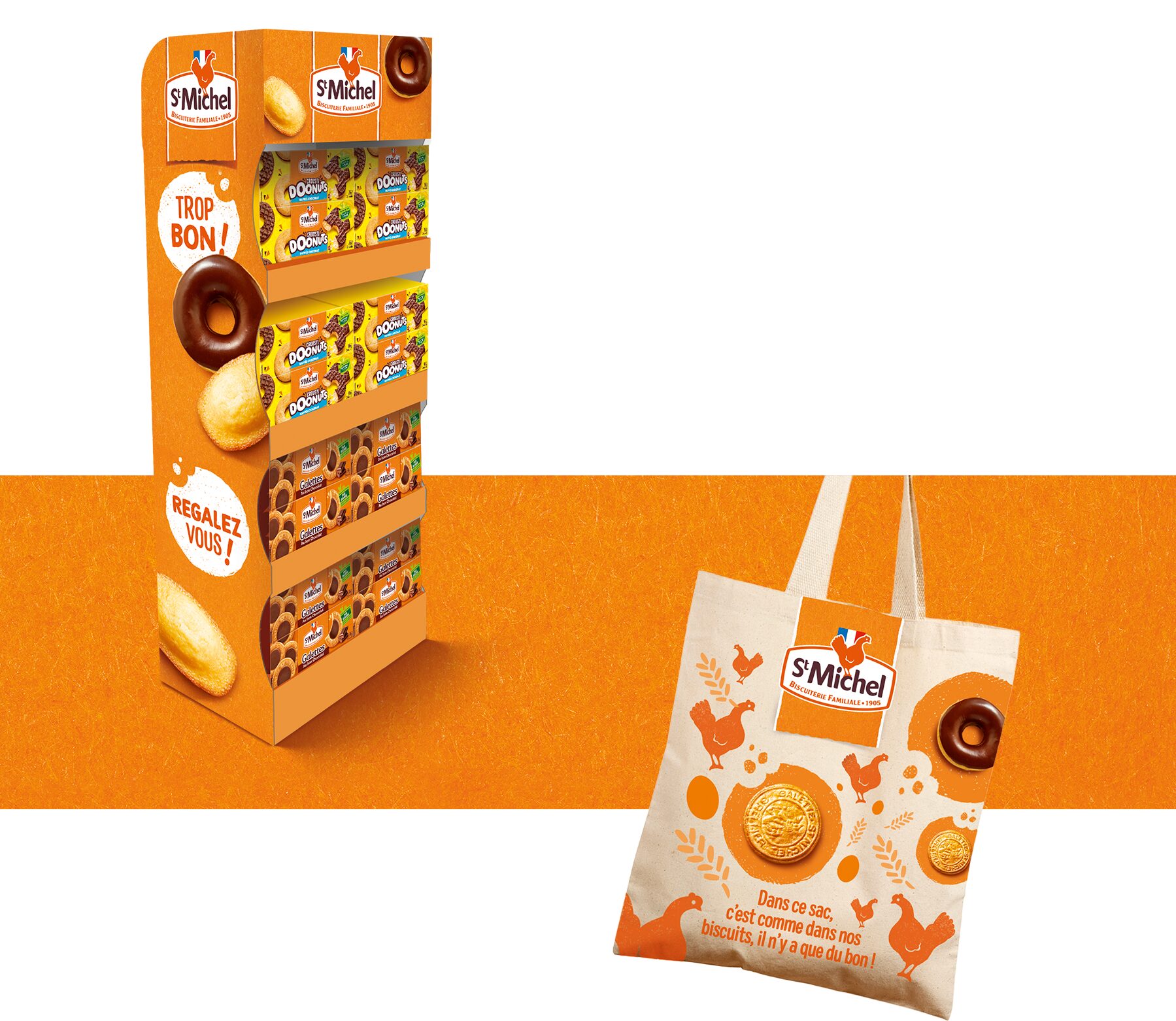
The reinstated orange brand color delivered outstanding and successful shelf-blocking power, while strengthening the coherence and memorability of St Michel across packaging, communication and brand experiences.