EVERYWHERE IN EVERY POCKET​

TicTac is one of the world’s most recognisable confectionery brands. Sold in over 100 countries, the iconic small box and its distinctive pill-shaped mints have made freshness a pocket-sized ritual for decades. A global brand with a simple promise, and everything to gain from making it sharper.TicTac trusted us to do exactly that.

ONE SMALL PROMISE

In a category defined by immediacy and scale, small formats leave little room for ambiguity. TicTac, operating globally and facing increasing innovation and fragmentation, needed a brand system able to express more than function. Precision, speed, and worldwide relevance.Team Creatif focused on articulating a simple, ownable product benefit and turning it into a coherent brand concept. “Gentle Freshness” became the strategic anchor, a sensory promise translated into form, rhythm and behaviour.

EVERYWHERE IN EVERY POCKET

TicTac is one of the world’s most recognisable confectionery brands. Sold in over 100 countries, the iconic small box and its distinctive pill-shaped mints have made freshness a pocket-sized ritual for decades. A global brand with a simple promise, and everything to gain from making it sharper.TicTac trusted us to do exactly that.

TOTAL TICТACNESS

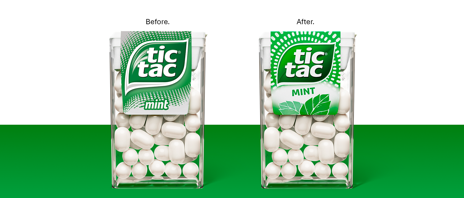
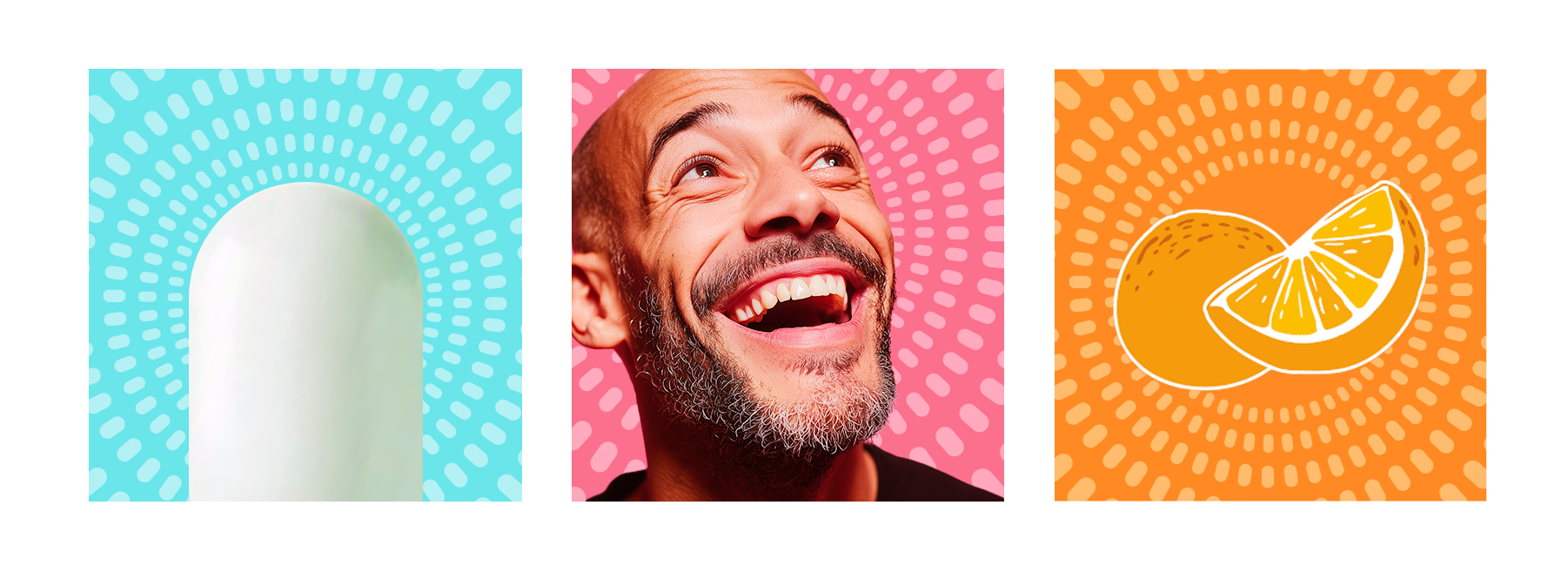
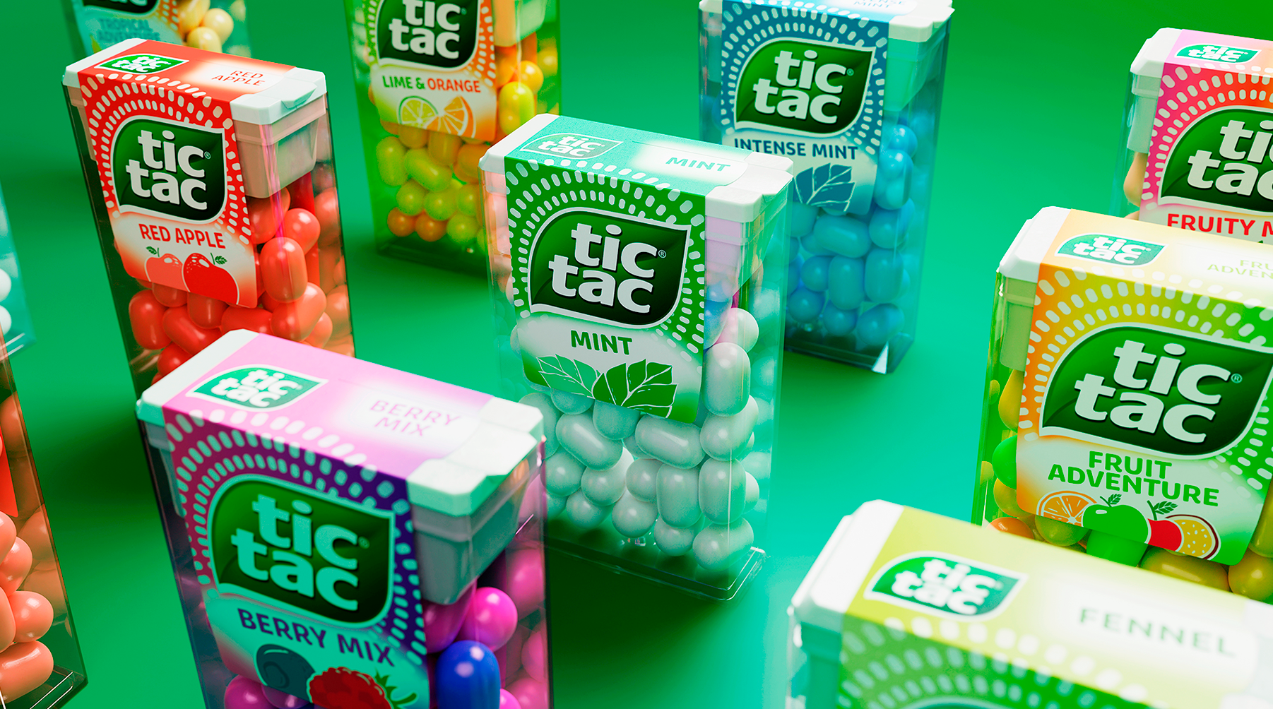
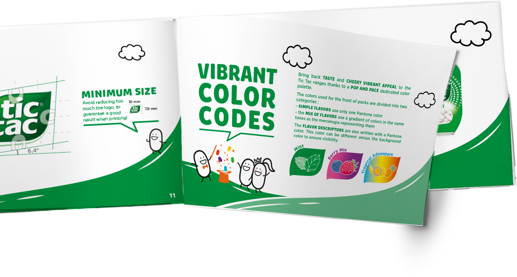
Defining “TicTacness” meant formalising the brand’s visual grammar in full. Logo evolution, ingredient illustration, colour logic, typography and iconography were treated as strategic assets. Each element was refined to work harder: to improve recognition, reinforce consistency and ensure global deployability, even at the smallest scale.

FRESH FOR GOOD

The result is a brand universe that feels unified, confident and immediately legible. A system built to endure, not to impress. By turning a product sensation into a disciplined design language, Team Creatif delivered clarity, coherence and long-term distinctiveness, equipping the brand for sustained performance and future growth.